
發覺本質與可能性,對燙金這項技術重新再覺察
每一年在製作箔樣時都會遇到不同的困難,今年的《箔樣+ Foil Catalogue+》更是耗費了比過往更長的時間製作。但都是希望在「台灣就能做到的」核心價值中,不斷的在嘗試燙金可以達到的樣貌。在燙金的過程中,我們發現部分箔在重複堆疊後也能產生有如平版印刷的疊色效果;在立揚箔業的協助下,《箔樣+ Foil Catalogue+》這件作品,除了補足原《箔樣》中沒有的金屬箔顏色,並針對「半透明箔」的特性創作一系列實驗作品,與大家分享我們充分嘗試「半透明箔」特性的成果。
我們其實從來都沒有發明新的技術,僅是帶大家重新發覺燙金的本質與其可能性,對這項技術重新再覺察。承繼最初的實驗精神,希望這過程得到的不只是一份樣品,更是藉此激發更多可能性。
The opaqueness and single-hue color scheme of both metal foil and pigment foil contribute to the technical limitation of hot foil stamping. Aside from the widely-known transparent foil, we have discovered that portions of foil, after stacking and overlapping it repetitiously, also can produce color overlapping, an effect that is similar to what becomes of offset printing; with the help of Lih Yang Foil, the piece named “Foil Catalogue+” does not simply make up for the metallic color lacking in “Foil Catalogue”, it includes a series of experimental works based on the characteristics of translucent foil. We would like to share the results of our experiments in totality with translucent foil.
We hope to let everyone discover anew the essential nature of various foils and their possibilities, awakening to the technique of gold foil stamping we inherit the spirit of experimentation that jumpstarted us, hoping that through this process we receive not only a mere sample, but excite also more possibilities.
箔押し印刷の一般的な金属箔また顔料箔は、どちらも色や不透明な特性などに影響されるため、印刷表現限界があります。しかし、平版印刷と同様に性質の異なる箔を重ね合わせることによって、不思議な奥行きのある表現にすることもできます。これらについて、私たちは台湾立揚箔業(Lih Yang Foil)の支援と協力を頂き、様々な実験を行いながら、共同で「箔樣プラス」を完成させました。
今回、見本「箔樣」に入っていない金屬箔に加え、様々で多様な半透明の箔を重ね合わせた実験的な作品も揃えています。「箔樣プラス」は、ただの見本としてではなく、 良い刺激となるサンプルを目指して、これからの表現域を広げるように制作しました。この「箔樣プラス」が、箔押し印刷の表現探究に寄与し、いろいろな角度から再考されるよう考えて行きましょう。
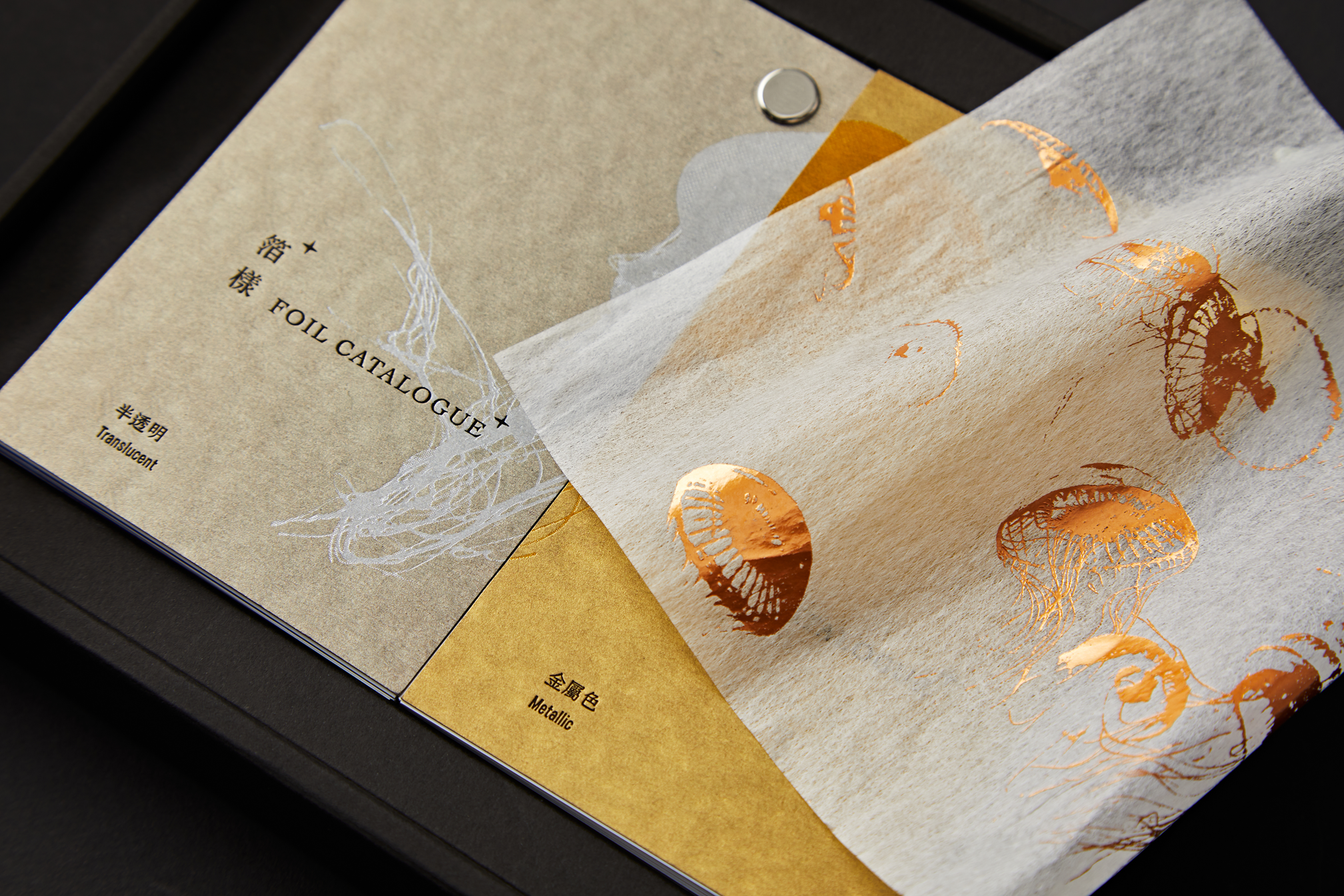


今年的主軸是希望跟大家分享的「半透明箔」的各式態樣。
因此在今年包裝設計中加入了各種「半透明」抽象或實際的元素並皆以具有半透明且優雅特性的水母,在各種表現上都大量的加入了各式水母的造型作為貫穿:
袖套上的隙縫,從隙縫中可看見《箔樣+》一角——是藉由「窺探的抽象意象」來表現半透明。
襯紙使用了在2018年《箔樣》裡使用過的 長春紙舖 的化纖棉紙,挑戰在約莫3條厚度的紙張上做大面積的燙金——此處亦是「紙張的特性」來表現半透明。
保證卡選用了燙金技術較複雜的 峻揚紙業 雪烙紙來製作,其特性在於在溫度與壓力的接觸之後,紙張會透出紙芯的半透明塑膠材質——此處是以「紙張後加工的變化」來表現半透明。
因此在今年包裝設計中加入了各種「半透明」抽象或實際的元素並皆以具有半透明且優雅特性的水母,在各種表現上都大量的加入了各式水母的造型作為貫穿:
袖套上的隙縫,從隙縫中可看見《箔樣+》一角——是藉由「窺探的抽象意象」來表現半透明。
襯紙使用了在2018年《箔樣》裡使用過的 長春紙舖 的化纖棉紙,挑戰在約莫3條厚度的紙張上做大面積的燙金——此處亦是「紙張的特性」來表現半透明。
保證卡選用了燙金技術較複雜的 峻揚紙業 雪烙紙來製作,其特性在於在溫度與壓力的接觸之後,紙張會透出紙芯的半透明塑膠材質——此處是以「紙張後加工的變化」來表現半透明。
-
初心
海流設計是一個期許自己能以設計的力量,成為默默影響社會的設計團隊。 工作之餘,每年我們會設計一份專案以期突破工作現況保有設計初衷,並希望從中探索新的可能性。這不僅是一份燙金的樣品,也是一份讓金箔如實呈現的實驗性作品。Flowing Design is a design studio pursuing positive social impact through the power of design. Besides commercial cases, we also launch several special projects every year. While carrying out these projects, we hope to break through the current situation that besets their development, retain the original intention of design, and seek new possibilities along the way. This is not just a sample of hot foil stamping, but an experimental project that presents genuinely the gold foil as it is.
設計|海流設計 Flowing Design / 燙金、印刷監製|泳勝采墨工作室 / 包裝印刷|富升印刷 / 金箔協力|立揚箔業科技 / 字型協力|文鼎字型 / 協力廠商|大亞紙業、立昌紙業、長瑩國際、長瑩國際(長春紙舖)、峻揚紙業、聯美紙業 / 商業攝影|無二創意 / 英文翻譯|Willy Du、Wanda Shen / 日文翻譯|Chihua Kao / 特別感謝|邱晏瑢(Intern)、Chu Wei、Wen Xuan-Zhang、Cindy Pong、シ ン、蘋果文創紙業、雲清藝術
Photo credit Interleaving paper - Jellyfish by Jorge Gonzalez / Sponsor Intro. - Mountain by Instagram:okangognako Translucent Work - Lotus by Alex Pearson / Translucent Work - Snake by Bethany KingTranslucent - Jellyfishby Thomas Dimson / Translucent - Printing Background Vera by Kratochvil
Photo credit Interleaving paper - Jellyfish by Jorge Gonzalez / Sponsor Intro. - Mountain by Instagram:okangognako Translucent Work - Lotus by Alex Pearson / Translucent Work - Snake by Bethany KingTranslucent - Jellyfishby Thomas Dimson / Translucent - Printing Background Vera by Kratochvil